The Product Page Playbook: Turn Ad Clicks Into Purchases
By
Frank Kenne
October 27, 2026
•
5 min read
Share this post
Introduction
Short answer: A product page turns paid clicks into purchases when it continues the exact promise of the ad that sent the visitor, shows the product, price and add-to-cart button on the first mobile screen, answers the buyer's real objections with proof, and removes every bit of friction between "I want this" and checkout. Fix message match first, the mobile first screen second, proof third and friction fourth, then test changes on revenue per visitor. That sequence raises revenue from traffic you are already paying for, which lowers CAC and lifts blended MER without adding a dollar of ad spend.
Key takeaways
For DTC brands running Meta ads, the product page (PDP) is usually the landing page. Treat it like one.
Message match is the first fix: same promise, same offer, same visual as the ad.
Design for a phone screen first. Product name, benefit, image, price, rating, variant and add-to-cart belong above the fold.
Proof sells more than adjectives: reviews with photos, a clear guarantee, shipping and returns stated plainly.
Remove friction: fewer variant clicks, visible total cost, express checkout, no surprise fees.
Test one big change at a time and judge it on revenue per visitor, not click-through or time on page.
Every visitor from a Meta or TikTok ad has already cost you money. When the page fails, you pay for the click and get nothing back. The usual leaks are predictable: a page that loads slowly on a phone, a headline that has nothing to do with the ad, a hero image that doesn't show what the product actually is, a price or shipping cost the visitor has to hunt for, and no answers to the two or three questions every buyer asks before paying.
Each of these gives a visitor a reason to leave. Fixing them is rarely glamorous, but it is usually the cheapest growth lever a DTC brand has. If your account looks healthy in Ads Manager but revenue isn't following, the problem is often on the page, not in the auction. We cover the ad side in why Meta ads aren't scaling even with a solid ROAS; this guide covers what happens after the click.
Should ad traffic go to a product page or a landing page?
For most DTC brands, the product page is the default destination for paid social, and it should be built to do a landing page's job. The rule is simple: never send paid traffic to the homepage. A homepage has many goals; a paid visitor needs one.
Send to the product page when the product is easy to understand, the price is familiar for the category, and the ad already shows the product in use. Warm and retargeting traffic almost always belongs here.
Send to a pre-sell or advertorial page first when the product needs explaining, the price is higher than the buyer expects, or the traffic is very cold. We explain that structure in how pre-sell pages turn cold clicks into buyers.
Use a dedicated landing page or bundle page for a specific offer, a launch, or a bundle you don't want to bury among variants.
Whichever you choose, the principles below are the same: one page, one goal, one primary call to action repeated as the visitor scrolls.
What is message match and how do you get it right?
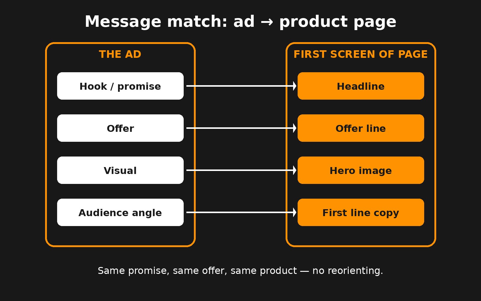
Message match means the page keeps the promise the ad made. A visitor who tapped an ad about "the travel bag that fits under any airline seat" should land on a page whose first line says exactly that, shows the same bag in the same color, and repeats the same offer. When the page switches the angle, the visitor has to reorient, and many won't bother.
Check four things for every ad set that drives meaningful spend:
Promise: the ad's main hook appears in the page headline or the first line under it.
Offer: any discount, bundle, free shipping or guarantee in the ad is visible on the first screen, not in a pop-up or at checkout.
Visual: the hero image or first gallery slot shows the product as it appeared in the ad (same color, same variant, ideally the same shot).
Audience: the language fits who the ad targeted. A gift angle and a self-purchase angle need different first lines.
When you run many angles, you rarely need many pages. Use variant pre-selection through URL parameters, a small set of angle-specific headlines, or two or three landing variants for your biggest angles. As your creative testing cadence finds winning hooks, carry the winners onto the page.
Message match: the promise, offer and visual in the ad should appear on the first screen of the page.
What does a high-converting product page include?
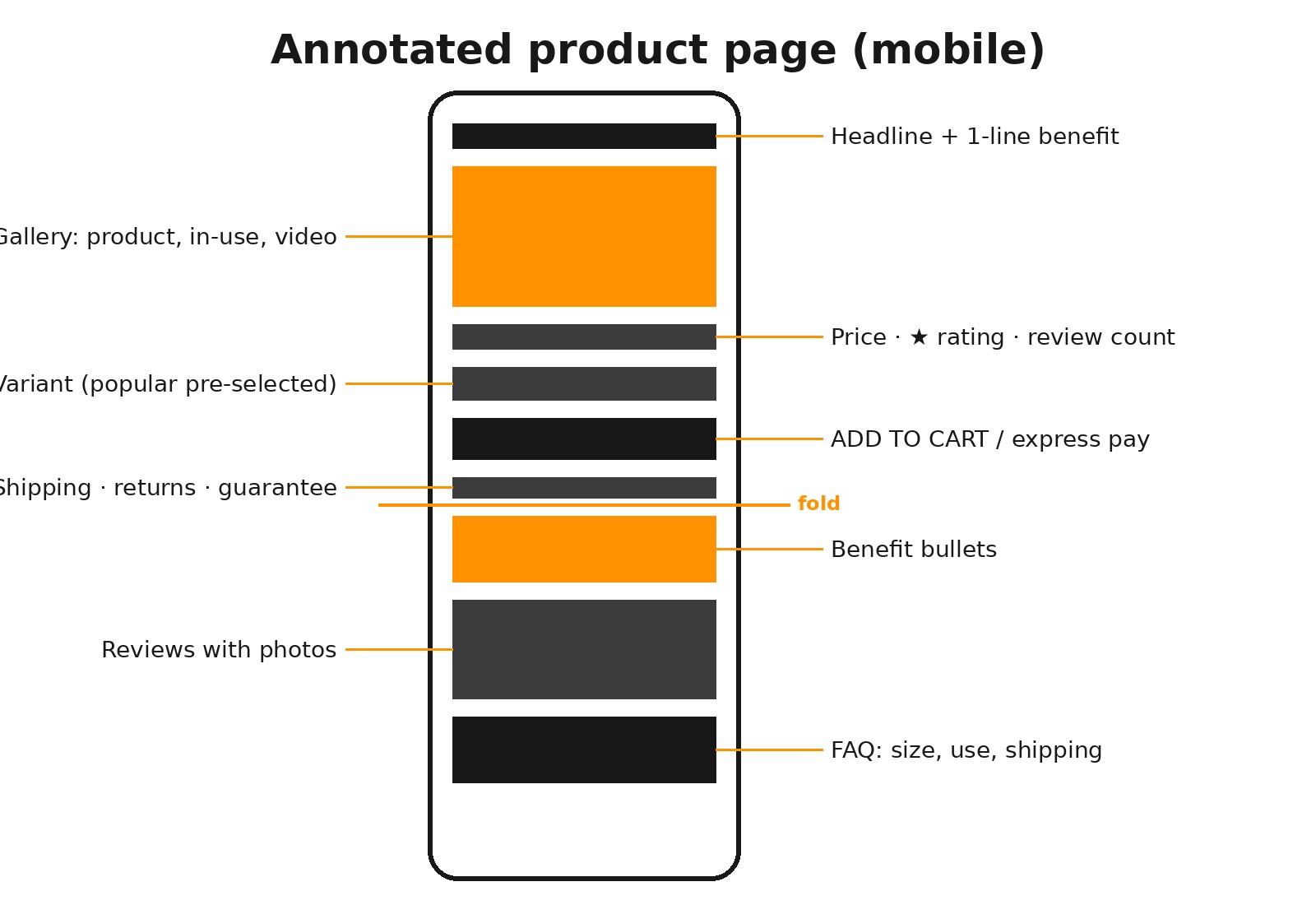
Strong product pages share the same anatomy. Order matters because most visitors scroll in a straight line and leave when a question goes unanswered.
Headline and one-line benefit that match the ad.
Gallery led by the clearest product shot, then in-use images, scale or size shots, and a short video.
Price, star rating and review count next to each other.
Variant selector with the most popular option pre-selected.
Add-to-cart button plus express checkout options.
Shipping, returns and guarantee line directly under the button.
Three to five benefit bullets in customer language.
How it works or what's included section.
Reviews with photos, filterable if you have many.
Comparison or "why us" block against the alternative buyers are considering.
FAQ covering sizing, use, shipping and returns.
Repeated call to action or a sticky add-to-cart bar on mobile.
Annotated PDP wireframe: what belongs on the first screen and what follows as the visitor scrolls.
What belongs above the fold on mobile?
Most paid social traffic arrives on a phone, so the first screen of a phone is the most valuable space you own. Design it first, then adapt to desktop. On a typical phone, the first screen should hold:
Product name and a one-line benefit that echoes the ad.
The main image, large enough to see the product clearly.
Price, star rating and review count.
The variant selector (or a clear default) and the add-to-cart button, or at least the top of it.
A short shipping and returns line.
Things that should not be there: a full-width announcement bar stacked on a promo bar, a cookie banner covering the button, an email pop-up that fires in the first few seconds, or a giant logo header. Each one pushes the button down or blocks it.
Speed matters as much as layout. Compress and correctly size images, lazy-load anything below the first screen, and audit apps and scripts regularly; on Shopify, unused apps often leave code behind. Test on a real mid-range phone on cellular data, not only on office Wi-Fi.
How should you write product page copy?
Start with the outcome the buyer wants, then give the details that prove you can deliver it. Features matter, but only once the visitor knows why they should care.
Use customer language. Pull phrases from reviews, support tickets and ad comments. If customers say "finally fits in my carry-on," use that, not "optimized dimensions."
Keep paragraphs short and use bullets for specs, materials and dimensions.
Answer the next question. After each section, ask what the buyer is wondering now, and answer it in the next block.
Be specific and honest. Concrete details (materials, dimensions, what's in the box, how long shipping takes) beat superlatives. Avoid claims you can't support, especially in regulated categories.
A paid visitor often doesn't know your brand. Proof replaces the trust they don't have yet. The strongest forms, roughly in order:
Reviews with photos or video from real customers, close to the add-to-cart button, with the rating and count visible above the fold.
A clear guarantee in plain words: what's covered, for how long, and how returns work.
Shipping and returns stated on the page, including delivery time and any cost. Surprise costs at checkout are one of the most common reasons buyers abandon.
User-generated content showing the product in real use, ideally the same creators or styles that perform in your ads.
Press, awards or retailer logos only if they are real and recognizable.
Secure checkout and payment badges near the button, kept small.
Present the offer clearly too. A bundle, free gift threshold or subscription option can lift order value without constant discounting.
How do you remove friction before checkout?
Once a visitor decides to buy, every extra step is a chance to lose them. Common fixes:
Pre-select the most popular variant so one tap adds to cart.
Offer express checkout (Shop Pay, Apple Pay, Google Pay, PayPal).
Show the total cost, including shipping, before checkout.
Use a slide-out cart instead of a separate cart page, and keep upsells there light.
Avoid forcing account creation.
Make size guides and compatibility info open in place, not on a new page.
Make sure tracking still works after you change the cart or checkout flow. If purchase events break, Meta optimizes on bad data; our analytics and tracking service covers that setup.
Product page teardown checklist
Run this checklist on your top three product pages by paid traffic. Open each page on a phone from the actual ad link.
Does the headline repeat the ad's hook within the first line?
Is the ad's offer visible on the first screen without a pop-up?
Does the first image show the same product and variant as the ad?
Are price, rating and review count visible without scrolling?
Can you add to cart in one tap from the first screen, or via a sticky bar?
Is shipping cost and delivery time stated under the button?
Is the return policy or guarantee one sentence away?
Do the first three bullets describe outcomes, not just features?
Are there reviews with photos above the midpoint of the page?
Does the FAQ answer sizing, use, shipping and returns?
Does the page load in a reasonable time on cellular data?
Are pop-ups delayed and easy to close?
Is express checkout available?
Do add-to-cart, initiate checkout and purchase events fire correctly?
Every "no" is a candidate test. Start with the ones that sit highest on the page and affect the most traffic.
How do you test and improve product pages?
Test big changes first: headline and angle, hero image, offer presentation, page structure, and pre-sell versus direct-to-PDP. Small tweaks like button color rarely move revenue enough to measure on DTC traffic levels.
One major change at a time, so you know what caused the result.
Measure revenue per visitor, which combines conversion rate and order value. A change that lifts conversion but cuts order value may not help.
Run long enough to collect a meaningful number of purchases per variant and cover at least one full week of buying patterns.
Prioritize by traffic: start with the pages that receive the most paid spend.
Use qualitative data (heatmaps, session recordings, post-purchase surveys) to find what to test, then confirm with an A/B test.
Connect results to the business. A better page lowers CAC and lets the same Meta budget reach a higher blended MER; see MER vs ROAS explained.
For a worked example of how page fixes compound with ad efficiency, read our conversion rate optimization case study. On our homepage, PIPWellness is listed with "86% CVR Improvement" and "-38% CPA Reduction" after a restructured Meta funnel and landing page optimization. Our conversion optimization service runs this process for DTC brands.
What is a good conversion rate for a product page?
It varies widely by category, price point and traffic source, so outside benchmarks are a weak guide. Compare against your own baseline by traffic source and improve from there, judging changes on revenue per visitor.
Should paid traffic go to the homepage?
Usually not. A focused product page or landing page that matches the ad converts better because it has one goal and continues the ad's promise.
What is message match?
Message match means the page repeats the promise, offer and visual of the ad that sent the visitor, so they immediately recognize they are in the right place.
How many calls to action should a product page have?
One primary action, add to cart, repeated down the page or kept in a sticky bar on mobile. Secondary links should not compete with it.
How long should a product page be?
Long enough to answer the objections buyers have for that product. Cold traffic and higher-priced products usually need more detail, proof and FAQ content than repeat buyers.
What tools help with product page testing?
Analytics to find drop-off, heatmaps and session recordings to see why, post-purchase surveys for buyer language, and an A/B testing tool to confirm fixes.
Ready to Build?
Want this applied to your brand?
Book a free 30-minute growth audit. We'll review your ads, tracking and site, and show you where the profit is leaking.
No commitment. No pitch deck. A real conversation about your growth architecture.
Written by Frank Kenne, Lion Media
Lion Media is a performance marketing agency for DTC ecommerce brands. We build paid media and growth systems around MER and contribution margin, not platform ROAS.